Introduction
Great user interfaces aren't just pretty—they're deeply rooted in how humans think and process information. Understanding the psychology behind design decisions can transform good interfaces into exceptional ones.
Visual Hierarchy: Guiding the Eye
The F-Pattern and Z-Pattern
Users scan content in predictable patterns:
- F-Pattern: Used for text-heavy content (blogs, articles)
- Z-Pattern: Used for simpler layouts (landing pages, forms)
Design with these patterns in mind to ensure important information gets seen.
Size, Color, and Contrast
Our brains process visual information in milliseconds:
- Larger elements appear more important
- High contrast draws attention
- Color creates emotional responses and hierarchy
Example hierarchy implementation:
/* Primary action */
.btn-primary {
    font-size: 18px;
    padding: 16px 32px;
    background: #3B82F6;
    box-shadow: 0 4px 14px rgba(59, 130, 246, 0.4);
}

/* Secondary action */
.btn-secondary {
    font-size: 16px;
    padding: 12px 24px;
    background: transparent;
    border: 2px solid #3B82F6;
}
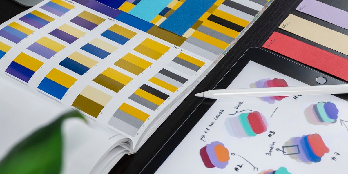
Color Psychology in UI
Colors evoke emotions and set expectations:
- Blue: Trust, stability (finance, healthcare)
- Green: Growth, success (productivity, environmental)
- Red: Urgency, importance (warnings, CTAs)
- Purple: Luxury, creativity (premium products)
- Orange: Energy, enthusiasm (sports, entertainment)
Color Application Tips
- 60-30-10 Rule: 60% dominant color, 30% secondary, 10% accent
- Accessibility: Ensure 4.5:1 contrast ratio for text
- Cultural Context: Colors mean different things globally
Gestalt Principles
Our brains group elements automatically:
1. Proximity
Elements close together are perceived as related. Group related form fields, menu items, and card content.
2. Similarity
Similar elements are perceived as part of the same group. Use consistent styling for similar actions.
3. Closure
We mentally complete incomplete shapes. Use this for loading states and progress indicators.
4. Continuity
Elements arranged on a line or curve are perceived as related. Use for navigation and step-by-step processes.
Cognitive Load: Less is More
Hick's Law
Decision time increases logarithmically with the number of choices.
Application:
- Limit menu items (7±2 rule)
- Break complex forms into steps
- Use progressive disclosure
- Provide defaults
Miller's Law
People can hold 7±2 items in working memory.
Application:
- Chunk information into groups
- Use breadcrumbs for deep navigation
- Limit form fields per page
- Break long lists into categories
Micro-Interactions: The Details Matter
Micro-interactions provide feedback and guide users:
Button States
.button {
    transition: all 0.2s ease;
}

.button:hover {
    transform: translateY(-2px);
    box-shadow: 0 6px 20px rgba(0,0,0,0.15);
}

.button:active {
    transform: translateY(0);
}

.button:disabled {
    opacity: 0.5;
    cursor: not-allowed;
}
Loading States
Always show progress:
- Skeleton screens for content loading
- Spinners for short waits (<3 seconds)
- Progress bars for longer operations
- Optimistic UI updates when possible
The Psychology of Forms
Forms are where users take action. Make them effortless:
Visual Design
- Single column layouts (easier to scan)
- Top-aligned labels (faster completion)
- Adequate spacing (reduces errors)
- Input field length matches expected input
Reduce Friction
- Use smart defaults
- Show password requirements upfront
- Validate inline, not on submit
- Save progress automatically
- Clear error messages with solutions
The Registration Form Example
Bad:
<form>
    <input type="text" placeholder="Enter your full name">
    <input type="email" placeholder="Enter your email address">
    <input type="password" placeholder="Enter a password">
    <input type="password" placeholder="Confirm your password">
    <input type="text" placeholder="Phone number">
    <input type="text" placeholder="Company name">
    <button>Create Account</button>
</form>
Good:
<form>
    <input type="email" placeholder="Email" autocomplete="email">
    <input type="password" placeholder="Password (min 8 characters)">
    <small>We'll never share your information.</small>
    <button>Create Account</button>
    <a href="#more-fields">Add optional info later →</a>
</form>
Feedback and Affordances
Affordances
Design elements that suggest their use:
- Buttons look pressable (shadows, borders)
- Links are underlined or colored
- Draggable elements show grab cursor
- Input fields have visible borders
Feedback Loops
Every action needs feedback:
- Immediate: Button press animation
- Progress: Loading indicators
- Completion: Success messages
- Error: Clear explanations with solutions
Dark Patterns to Avoid
Never manipulate users:
- Hidden costs: Show all prices upfront
- Forced continuity: Easy cancellation
- Confirmshaming: Respectful opt-outs
- Disguised ads: Clear content labeling
Mobile-First Thinking
Design for touch:
- Minimum tap target: 44x44px
- Thumb-friendly: Important actions at bottom
- Reduce typing: Use native pickers and toggles
- Progressive enhancement: Mobile core, desktop enhanced
Testing Your Design Assumptions
Don't trust your gut alone:
- 5-Second Test: What do users remember?
- First Click Test: Where do users expect to click?
- A/B Testing: Let data decide
- User Interviews: Ask "why" five times
Practical Implementation
Here's a checklist for your next UI:
Visual Hierarchy
- [ ] Clear primary action
- [ ] Consistent spacing scale
- [ ] Logical information flow
- [ ] Readable typography (16px minimum)
Colors & Contrast
- [ ] Accessible contrast ratios
- [ ] Consistent color palette
- [ ] Purposeful color usage
- [ ] Dark mode consideration
Interactions
- [ ] Clear hover states
- [ ] Loading indicators
- [ ] Error messages with solutions
- [ ] Success confirmations
Forms
- [ ] Minimal required fields
- [ ] Inline validation
- [ ] Clear labels
- [ ] Auto-save if possible
Conclusion
Great UI design isn't about following trends—it's about understanding human psychology and applying that knowledge thoughtfully. Test your assumptions, iterate based on feedback, and always prioritize user needs over aesthetic preferences.
Remember: The best interface is the one users don't think about.